
 Given that my lists on the ugliest hockey jerseys and ugliest baseball jerseys are my two most read posts, continuing the series was a no-brainer. Coinciding it with the end of the NBA Finals is decent timing on my part, but the truth is, I started working on this list months ago and gave up. The history of the NBA simply doesn’t get much attention, so the resources for finding some of these ugly jerseys was getting too difficult. It’s a league very much focused on the now, paying little attention to anything that happened before Magic and Larry, other than the obligatory nod to Dr. J, Russell’s Celtics, and Wilt. But I persevered, using the knowledge that people everywhere will click over to this blog, get pissed because I’m insulting their favourite team, and then never visit again.
To tell the truth, I could easily do ten butt-ugly jerseys from the mid-to-late 90s alone, and it would look pretty convincing. A basketball jersey should be a simple thing: choose a two-colour scheme (with maybe a third shade for accents), put a word mark across the chest, number on the stomach, number on the back, done. Sure, you could mess it up by choosing ugly colours, but more often (and especially throughout the mid-to-late 90s) what makes an ugly jersey is messing with this formula. There’s not a lot of real estate on a basketball jersey, so when teams try to push the limits, the results are usually gaudy monstrosities.
One note: given that there’s some repeat offenders, I’ve limited this list to one jersey per team. That way this whole list wouldn’t be all Detroit, Philadelphia, and Cleveland. Also, given the spotty info available out there on NBA history, some of my dates might be wrong. Feel free to point them out, just try not to think of me as stupid for making them (instead, rely on my opinions and prose to make your judgements on my intelligence).

#10. Oklahoma City Thunder Road 2008-present – The ugliest regular jersey in the NBA today. It’s not even so much that the Thunder’s jersey is ugly (although it is), it’s that it’s so fucking generic. It looks like the kind of jersey you’d have seen on some 80s basketball video game that didn’t have the license to show real NBA teams. It looks like something you’d see in the Walmart kid’s section with “B-ball” written across the chest. Which leads me to the other problem: there are too many fucking letters across the chest! I realize that being in Oklahoma City was Clay Bennett’s goal in life (oh yeah, by the way… FUCK YOU CLAY BENNETT), but once you got there, you had to realize that it’s too long a name to squeeze on a jersey. Look how small that font is. It’s like trying to fit Szczerbiak on the back of a kid’s jersey (you know, if you hated your kid or something). The problem is compounded by their bull-headed insistence of using a tri-coloured font, which only makes things smaller. The smart thing would’ve been to go with “Oklahoma” (given that I doubt Tulsa will be getting a team soon), or “OKC”, or just “Thunder” on home and away (that’s what San Antonio does… only with “Spurs” of course). Of course, the smartest thing would’ve been to never leave Seattle in the first place.

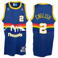
#9. Denver Nuggets Road 1981-1985 – In recent years, this has become the “so ugly it’s cool” retro jersey of the NBA (like how the Houston Astros tequila sunrise jersey is in baseball), but when people are thinking about the retro Nuggets jersey they like, they’re thinking of the later version, not this one. I’ll admit, I have a certain fondness for the late 80s version (popularized by Alex English), even though it looks like Rainbow Brite puked her Skittles all over it, but this one with the navy and dark green is just plain ugly. If you’re going to go that colourful with the logo, then you really should go bright with the rest of the uniform too.

#8. Atlanta Hawks Road 1995-99 – The first example of the crimes of the mid-to-late 90s (which, fair warning, will take up 5 of the next 7 jerseys). This is a perfect example of the sins of that period: where the number should be, they decided to stick a huge fucking bird on the front. Here’s a lesson for all basketball jersey designers that I’m sure are following this blog: BASKETBALL JERSEYS ARE NOT HOCKEY JERSEYS. Logos shouldn’t go in the front, and they definitely shouldn’t dominate the jersey. As an added bonus, this one features a sublimated silkscreen print in order to achieve that ugly-ass red-to-black colour gradient, which helps bring the joy of using cheaper materials to achieve a worse effect.

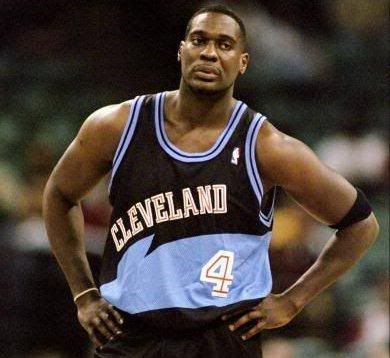
#7. Cleveland Cavaliers Home 1974-81 – Maybe they figured the eye strain caused by the barber pole striped piping would give them a strategic advantage? There was also a burgundy road version of this that was plenty ugly, but the putrid mustard pushes this one over the top. The truth is, the Cavaliers have never had a good jersey, just a range of acceptable to completely awful. Choosing the most awful wasn’t easy, with their own late 90s abomination, and the current throwbacks you’ve seen on LeBron of late that look like the uniform of a rec league team sponsored by a fast food chicken joint. If King James does leave in 2010, the jerseys might play a part.

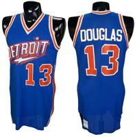
#6. Detroit Pistons Road 1995-2001 – Only in this period would a team go from a classic design like this to the abomination you see before you. There are few crimes worse than going royal blue to wimpy teal; luckily, this jersey finds a way to commit a worse crime. Some marketing guru somewhere ran the numbers and said that teams with animal mascots sell more merch, and thus teams start going out of their way to incorporate animals into their logos. Which you’d think difficult for a franchise named after a car part, but apparently, when you don’t have an animal that makes sense with your team name, you just go with a flaming horse’s head. I guess the stretch here is “horsepower”. Whatevs.
FULL, EMBARRASSING DISCLOSURE: I once owned this jersey. There’s no defense for that, especially since I knew at the time it was ugly. Basically, I had started working at a jersey store, and had a burning desire to buy a new NBA jersey. Unfortunately, we only carried about 5 or 6 different NBA jerseys, so I decided to get this one not because I liked it, but because I liked the team and I liked Grant Hill. I later compounded the problem by buying matching shorts, which I wore with the jersey a total of once before realizing what a complete jag off I looked like wearing a matching jersey and shorts, especially ones that were butt ugly. Let this be a lesson: bad jerseys can happen to anyone if they’re not sufficiently vigilant.

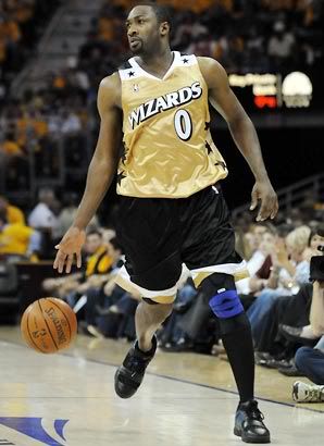
#5. Washington Wizards Alternate 2004-2009 – This is a list of ugly jerseys, not uniforms, so I haven’t spent much time discussing shorts. In part, this is because if I extended this to the whole uniform, number one would have to be all the shorts worn in the 80s. But more than that, shorts usually match the jersey, so whatever crime was committed in the jersey is often repeated in the shorts. Not so with this uggo, which becomes worse when paired with black shorts. Technically, they match, with the black shorts echoing the black shoulders, and the gold jersey with the gold and white piping, but in practice, the whole thing feels mismatched and heightens the ugliness. This is an odd jersey, in that you get the sense they were trying something… formal? I don’t get it, but I know I don’t like it.

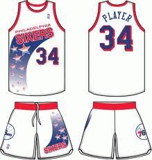
#4. Philadelphia 76ers Road 1991-94 – This is the first jersey I can remember really hating, in any sport. They switched from this simple design, to something Charles Barkley described as looking like “my daughter drew them with some crayons”, which is not the reaction you want from the guy who’s name is on the back of the new merchandise you’re hoping to sell. Speaking of shorts, the Sixers compounded the problem of having a horrific jersey by continuing the tacky star wipe effect on the other side of the shorts. I’ve already gone on at length about all the crimes committed in the world of NBA jerseys in the late 90s, well this is the one that started it all. What I don’t understand is how the rest of the league didn’t look at how awful this jersey is with a large portion of the front dedicated to an image instead of a number, and decide collectively to never make that mistake again.

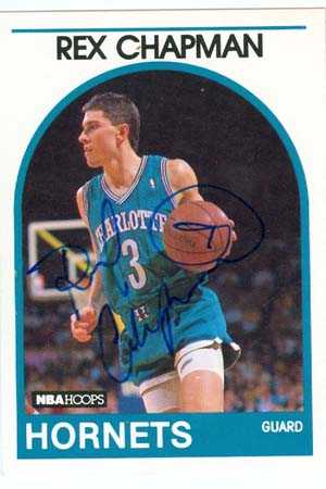
#3. Vancouver Grizzlies Road 1995-2000 – Imagine being a hoops-mad young Canadian (as I was), finding out that your homeland would be getting not one, but two NBA franchises. Then imagine your disappointment when all the apparel made for both franchises is so embarrassingly ugly that any thought of supporting them is instantly banished. I’m probably overstating this, but perhaps the worst thing to happen to professional sports is the colour teal. After the Charlotte Hornets had unexpected success with merchandise sales with their teal jerseys (another true confession: I owned a Rex Chapman Hornets jersey), a bunch of expansion franchises gave some variation of the colour a shot. I’m not sure it ever worked for anyone but the Hornets, but worse is how many different shades get called “teal”. If you’re gonna try and jump on the teal trend, it might be a good idea to stick to the bluer variation, rather than the turquoise one the Grizzlies went with, which looks more like grandma’s sofa than it does modern and cool. And why go to the trouble of naming yourself after one of the most vicious mammals on earth if you’re gonna go with such a wimpy colour? And the less said about the busy, Haida-inspired sleeve and colour piping the better. I’m of the mind that more Vancouverites were shamed by wearing ugly Bryant “Big Country” Reeves jerseys than they were when Steve Francis refused to play for them.

#2. Toronto Raptors Road 1995-99 – Way to prove that Canadians know nothing about basketball guys. What a fucking joke these jerseys were. It starts with the name, “Raptors”, clearly picked to try and cash in on that fat Jurassic Park cash. When the franchise was awarded to Toronto, representatives of the team did a tour of Canadian schools to ask what the name should be/try to win the hearts and minds of Canada. My high school was one of those schools, where they presented us with 8 or so choices and had us vote by cheers. Believe me when I tell you that Raptors was not a popular choice, and that the reps were puzzled by this reaction. It’s a little sad when a bunch of teenagers have more foresight than a team of marketing people, and know that naming your team after a trendy term was not a good idea (think about it: had you ever heard of a velociraptor before that movie came out? It’d be like naming your team the Hobbits a few years ago).
Okay, so you decide that you have to go with Raptors… at least it’s original. But if you’re going to name your team after a dinosaur, you absolutely CANNOT use purple as one of your primary colours. You just can’t. Then you go with a red dinosaur (you know, for authenticity’s sake) as the primary feature of the jersey, rather than the name or number, which not only clashes with the deep purple, but also shows what happens when a basketball team is put into a hockey town. Add in black (which can’t be seen on top of deep purple), and silver jagged pinstripes, and a juvenile, jagged font, and you have the ugliest regular jersey in NBA history, and possibly in all of sports history.

#1. Milwaukee Bucks Alternate 1996-97 – I had this list all picked out with the Raptors comfortably in first place. Then while looking for jersey images I came across this abomination… and threw up a little in my mouth. I’d never seen it before, as I’m guessing it was only worn a few times that year as a third jersey, but it is clearly the ugliest jersey ever worn on a basketball court. No more needs to be said.
Dishonourable Mentions: Houston Rockets 1995-2003, Detroit Pistons 1978-79, Sacramento Kings Alternates 1994-97, Sacramento Kings Alternates 2005-07, San Antonio Spurs 80s
Related:
Top 10 Ugliest NHL Jerseys of All-Time
Top 10 Ugliest Uniforms in Baseball History


Those are some pretty disgusting jersey but I like the Wizards one… i think its just the colors though
http://www.fredjsmilek.com
That Cavs home jersey at number 7 looks like a lost prop from a McDonald’s commercial. And being from Michigan, I apologize on our behalf for the horse’s head Pistons logo. Eew.
That’s it; Ronald McDonald! I am so upset I missed that joke.
Pingback: Top 10 Ugliest Uniforms in Baseball History « Critically Speaking
i only like the 90s jerseys because they remind me of my beloved 90’s lol… i guess the pistons one is the only one i really hate,oh and the OKC thunder. Just horrible.
Couple things:
1. The 90s are a lot more horrible than Gen Y really wants to admit.
2. how on earth are those horrendous rockets uniforms an honorable mention? those things are fucking horrendous. I think Barkley, who you already mentioned making fun of those stupid sixers jerseys, likened them to pyjamas.
also, while they aren’t necessarily bad, I really don’t like how the Sixers wear black now.
The only reasons why the Rockets aren’t in the top ten proper is A) I didn’t want this list to be too dominated by the 90s, so I left it out to get some variety (which is also why I went with the older Cavaliers jersey for the write-up, as opposed to their own abysmal 90s edition), and B) I couldn’t get a picture of an actual jersey on its own. But it is awful (and I’d say it’s a bit criminal too, since the Rockets had just won two championships in their previous jerseys. You don’t change jerseys in mid-championship run).
The top 10 was pretty good. But i like the wizards jersey actually. I know lots of people dislike it, but its not that bad
In my opinion, the only team that teal worked on was the San Jose Sharks. I never cared for the Hornets’ unis anyway. The Sharks, at least, had two factors in their favor – the color evokes the sea, the ocean, namely the native habitat of the creature the team was named for; and their other colors were rather neutral, silver and black, and not purple, burgundy, orange, or any other clashing color. None of these NBA teams using a variation of blue-green seems to have learned the Sharks’ lesson. (Nor the Sharks, sadly, when they added the orange from the stick in the logo as trim to their Edge jerseys… what a disappointment.)
Yeah, the Pistons horse’s head was an embarrassment. In the final year of that scheme, they wore their red alternates so much, the NBA stepped in and forced them to wear the “Pistons green” road jersey (which was still their official road jersey) for the end of the season. Pistons fans were so relieved when Joe Dumars and the organization brought back the classic colors in the summer of 2001.
I think my TV broke when I tuned in on a game that had the Bucks wearing that jersey! I had a crappy TV at the time anyway.
Another disclosure: I have a Sharks jersey hanging in my closet right now. It’s the second generation one (the ones that were alternates until they became regular jerseys, with the shimmer fabric sleeves). But my wife hates it, so in the closet it stays.
I liked the article man, that Bucks jersey is horrible, and so is the Pistons Damn.
I don’t like the article.
for me, this is only a few NBA jerseys are not so good, such as current Orlando and Charlotte. Basically I enjoy different design and colorway of every jersey. The raptors, hawks and nuggets jerseys, which from your list, are the most beautiful jerseys I have ever seen.
If they are ugly, why did Mitchell Ness manufacture them in recent years ??
“If they are ugly, why did Mitchell Ness manufacture them in recent years ??”
Because different people have different tastes?
Or perhaps because it’s their very ugliness that makes them desirable in the kitch/retro market. This is the same reason why some people still wear pale blue tuxedos — thinking that wearing something largely dismissed as ugly will make them seem ironic.
i actually think the color scheme for the raptors worked. i can see what you are saying for a city like toronto, hockey town and pretty much every sports team is blue in toronto. but you’d be surprised at how many raptors fans today think the purple should have stayed (now its black, red and white)
I don’t necessarily have a problem with purple in principle (my favourite NBA team is the Lakers, and favourite NFL is the Vikings), it’s more that a team named after a dinosaur is just asking for Barney comparisons if purple is their primary colour. Moreover, it clashes with the red, and makes the black unnecessary.
I HAVE TO SAY FUCK WHO EVER THINKS THIS IM THE NUMBER 1 FAN OF THE BUCKS AND GRIZZLIES BUT THE RAPTORS AND HAWKS IS BADASS SO YEA FUCK YOU THOSE 4 JERSEYS KICK ASS N THE WIZARDS SUCKS BALLS LIKE WHO EVER THOUGHT THIS
yea wat william said nukka!!!!!!!!!!!!!!!!!!!!!!!!!!!!!!!!!!!!!!!!!!!!!!!!
These are the top ten coolest jerseys of al time especially the wizards
I don’t mind the Pistons Jersey but the royal blue road blue looks better but why a horse on a Jersey? I mean the NBA in the 90’s did have its share of female fans so maybe they thought females would buy a Jersey with a horse on it? Those 80’s/early 90’s Nuggets Jersey look bad and not in a good way either. Never liked any Atlanta hawks Jersey. The Sixers road Jersey from 1991-1994 ok maybe it looked a pajama top but the home jersey from that period didn’t look that bad. The 1995-2003 Rockets jerseys and logo are terrible. Glad they reverted back to the red and white.That Milwaukee Bucks Jersey that was posted on her is terrible. I mean the deer logo is good but to put on a uniform like that. I don’t think so. Those Wizards jersey’s look terrible(the gold one.)
I agree about the 76ers home jerseys. In fact, it’s often the case that a really ugly design is tempered by a less offensive home jersey, if for no other reason than the garishness is brought down by the white jerseys.
You’re probably just another anti-Toronto anything so of course you’ll hate the Raptors jersey.
Well, I am from that part of Canada that hates Toronto (which I believe is called “the rest of Canada”), but I like to think I’m being objective on this. For instance, if I were to do a best NHL jerseys of all-time, some version of the Maple Leafs jersey would be on that list.
Pingback: Critically Speaking 2010 blogging in review « Critically Speaking
why’d you get rid of some of the ugly ones. if they’re this ugly then you can wear them as a joke every once in a while
FUCK YOU GO DIE THESE JERSEYS ARE THE BEES FUCKING KNEES. So classic, so 90’s…go hide under a rock. I hate you. Me and my friend want to know your address so we can answer it wearing these retro jersey’s and stab you in the jugular.
Ha ha ha ha ha, OMG, funnnnnnnnnnyyyyyyyyyy!!!!!!!!!!!
You should be angry at the NBA commission and every team in the league, because they are all the same now, wearing lame garbage uniforms. The 90’s uniforms were fun.
The sixers and the bucks jerseys are just terrible. I Like the nuggets and the pistons jerseys the most though. I think those are two of the best jerseys of all time lol. The “ugliest” jerseys are alwaus the best!
I hated those Raptors jerseys when they came out. Now I think they look fantastic.
I liked the Raptors 2nd jerseys, the Purple and Red jerseys with the black and silver down the sides, those were cool. I liked the combination of Purple, Red, and Black, it was different, no other team used that combination. The Raptors current jerseys are Red and Black, mediocre and boring. I don’t like Red and Black alone, the purple was the life of their uniform.
Pingback: Three stripes and you’re out | rightkicks
I like the Raptors jersey. The colors do clash, but, what about the white jerseys? I’m wearing one as I type this. The white Raptors jersey with the “Raptor” on front is just awesome.
I agree with a lot on this list. I would have put the Hawk jersey on the #1 spot however. Not because it is the ugliest one out there, but because the Hawks used to have one of the coolest uniforms ever.
The change of style was even worse than trading Wilins for Manning. Did anyone ever go to jail for that?
Wilkins*
Your a dumbass those jerseys are so nice. Jerseys now are so boring you must just be a mainstream no fun no creativity basketball weirdo.
I just want to say you are 100% correct. Thunder should have never left Seattle where they were so successful. Now, they are doing horrible and can barely cut it in the west. Nice one.
Yes, and I’m sure all their current success is a result of their home arena, and has nothing to do with the talent they amassed as a result of their years in Seattle.
If they were still in the Pacific Northwest in jerseys that didn’t suck, I bet Kevin Durant, Russell Westbrook, and Serge Ibaka would never have become stars. Probably because of the rain.
Man, I actually like half of these jerseys! I thought the Pistons ones were awesome. I was also about 5 y/o at the time too…
All your worries are waiting to get a solution
and also the option would be merely a click ahead. Do you will though
of getting the money assistance the very fast you applied without tedious tasks.
The only hurdle to accessing this is of course human limitations and the fact that
the brain does not function solely as a learning tool for the human being.
Brazenhead is a great place to go with your family or for a business lunch or dinner, but
if you are looking for a party atmosphere, this isn’t it. Theme Format: It is almost like standard format of the pub quiz.
Kinda interesting, but Milwaukee Bucks Alternate as number one!?
That’s one of/the nicest ‘different’ NBA jerseys ever, what are you smoking?!
This design has recently been re-issued too…can’t believe you never even knew it existed.
I own the New Orleans Hornets Mardi Gras jersey which is considered to be one of the ugliest of recent years, so what?
I think you’d be surprised to see that most of the jerseys on this list are worth a lot more than regular ones.
Ugly and rare go hand in hand in the jersey market.
The only people laughing are the ones that own them (laughing to the bank)
Bucks, Raptors and Pistons were freaking beautiful!
I actually liked the Bucks one at the time–I saw it in only one game and kept wondering when they’d bring it back. Remember they were wearing purple every game, which I never thought looked right.
As a Piston fan, the teal was horrible but I didn’t mind the red alternates.
Sir, I might think you lack of fantasy. I think those 90’s jerseys are the most beautiful ones, because they were so naively daring and original. If you look at jerseys today, except for a few, they all look alike. The Lakers did all look the same since like ever, same goes for Boston. My personal favorites (despite being a Bulls fan, another jersey that looked always the same since the late 80’s) were Malone’s Utah, followed by Barkley’s suns, and then all the others of that era. I personally think the Rockets, Raptors, Grizzlies, Hawks, Pistons and Bucks were great, new and exciting. At least, they’ve tried something different. And I think they’re much better than any of the terribly boring (or ugly – see Golden State) jerseys today.
Tom is right on with what he is saying, the 1990’s jerseys were original and fun. The current marketing team has a blank thought process, has zero imagination, zero ability to create a unique Image, it’s garbage. Shame on the NBA! Shame!
Since the Lakers debuted their new uniforms in 1999 or 2000, I have pretty much been bored and sickened by how plain and average all of the new jerseys are. The league/teams made NBA jerseys look worse than college uniforms. The 1st Raptors jersey was goofy, the designers could have sketched a really cool dinosaur logo, but instead, they drew a dinosaur that looked like a picture you would see on the wall of a daycare. I can’t stand the over use of the colors Red, and blue, it’s tacky and obnoxious. I agree that teal is a boring pointless color to use, I too once owned that tacky Grant Hill jersey, and I didn’t even like Grant Hill, and still don’t. I think that all teams should incorporate a small logo on the front or side of their jerseys, it would add needed style, but not to the point where the logo is excessive, being so huge that the wings of the bird wrap all the way around the sides of the jersey (like the old Hawks jerseys). The Knicks never did have a logo, what they need to do is re-name that lousy team of theirs, who would want to be a Knickerbocker? And the Brooklyn Nets logo in no way whatsoever would even give you a clue that they were a basketball team, black and white jerseys are just awful! The whole league is saturated in unattractive color schemes and logos. I have no desire to buy any replica jersey they have for sale. The only uniforms that I have ever liked were the Phoenix Suns (sun rays logo) uniforms from the mid 90’s, the Philadelphia 76ers (red, blue, black and gold) uniforms from the late 90’s-2000’s time period, and the current Golden State Warriors uniforms with the Golden Gate bridge logo.